Volunteering and Big Data: the NGO Aid Map
Big Data matters. It has proven to be accurate in realizing trends, developing strategies, and noticing rising phenomena. It is a tool being used more frequently with each passing year that helps governments, scientists, educators, academics, and businesses operate in the most efficient ways possible.
Statistics and massive data are no longer being used solely by political pollsters and economists. Now, even philanthropy and global aid are reaping the benefits of big data. One example of this relatively new use of big data is the NGO Aid Map, which complies massive amounts of volunteer data into a useful and informative tool.
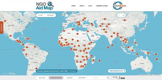
The NGO Aid Map is an interactive map designed by global aid advocacy group InterAction. The map shows a 2D image of Earth, akin to Google Maps, and features a series of numbered orange circles corresponding to individual countries. The number in the circle represents the number of Non-Governmental Organizations currently active in its respective nation.
Circles vary by size: the larger, the more projects. Users can click on the country that they are interested in. Upon clicking, the map zooms in to frame the specific country and then breaks the initial circle into smaller parts separated by city, town or region.
Clicking on a city or region circle brings users to a list of the ongoing projects in that area, each with an external link, a listing of the NGO conducting the project, and a short description of its mission.
The Aid Map is designed for optimal usability. Users can select from a number of filters to show where aid is needed most based on a series of metrics. These include poverty rate, malnutrition prevalence, agricultural share of GDP, and gross aid income (Official Development Assistance).
Clicking on any one filter will highlight countries based on their score. It is clear based on color contrasts which countries need more assistance in a given area. Some countries rank severely on multiple metrics.
Data for the map is compiled by volunteers on the ground who send their reports back to InterAction. The larger organization then compiles all that data and puts it into the map, where large amounts of numbers tell large amounts of stories. Users can empirically see the missions listed by “sectors.”
For example, InterAction reports that there are 1,679 medical missions, and 1,220 education projects ongoing. It also uses the data to list countries with the most, and alternatively least, amount of projects.
The map is a powerful tool that enables users to gain valuable insight into exactly what is being done around the globe to combat famine, poverty, and disease. InterAction, along with many others, hope that numbers and data will help make aid more efficient and effective in the near future.
– Joe Kitaj
Sources: NGO Aid Map, Interaction
Photo: Flickr
